Sunday, November 19, 2017

Has GE Bottomed?

That iconic blue chip stock GE sure has been beaten up recently.  In general, the market tends to lead the fundamentals by six to nine months, so, has the market already incorporated all the recent and expected bad news, and are we at a buyable bottom?  There's one indication that it may have, and that's insider buying.  Four days ago the new CEO bought $1.1 million dollars worth, after buying $2.6 million in August. 

One can easily find a boatload of info and speculation about GE's fundamentals, so I'm not going into that.  Instead, let's see what insight can be gained by applying Midas technical analysis to GE on several different time frames. 

First, the very long term view, the quarterly bars chart back to 1985...

This, and all the charts in this post, are equivolume, making the horizontal axis linear in cumulative volume, not time.  The orange dashed vertical lines are equispaced and identify major bottoms, starting with the crash of 1987.  This is an analysis technique developed by Richard W. Arms Jr in his book, "Volume Cycles in the Stock Market" (Equis International, 1994),  and which I explain in our book, "Midas Technical Analysis" (Coles & Hawkins, Wiley, 2011).  It shows that major bottoms tend to cyclically repeat, not in time but in cumulative volume.  And here with GE, we see it's now at a major volume periodic bottom.  This is very bullish.  [For equal spacing, that 2009 vertical line really should be placed in the middle of the previous large black candle, but the charting software won't let me put it there.]

The green curve S1 is the Midas support curve launched from the 2009 low, and we see that price is now right at that support, also very bullish.

Now let's go up to the next time frame, the monthly bars chart...


Lots going on here.  The BottomFinder is more than 90% complete, looking like it will finish within a month.  The Money Flow Index oscillator in the upper pane shows that GE is severely oversold now.  The blue bars illustrate another analysis technique developed by Arms which he calls Price Projection, which I also explain in our book.  Basically, it says that the cumulative volume going across a top will be expended in the subsequent downtrend.  This implies here that downward pressure on the stock may continue beyond the end of the BottomFinder, a somewhat bearish indication.  

Moving up the time frames again, the weekly bars chart doesn't show anything significant, so I'll omit it here and go directly to the daily bars chart...

 This is a significant downtrend since mid September, but it's not an accelerated downtrend because the peaks are not close to their previous red resistance curves, thus we cannot apply a BottomFinder to this trend.  But, look at the last five days; this could very well be a washout bottom - heavy volume on strong downward movement, halting and reversing at a major support level.  

In summary from all these charts, the preponderance of all these indications is bullish for GE being at a major bottom right now.  No guarantees, of course, but enough for me to prepare to enter the stock.  The green dashed curve is located above the near-in resistance curve by 3/4 of the average height of the last dozen price bars; that's my buy-stop curve.  I'll enter when price hits that curve.  And the red dashed curve is similarly located below the bottom, and is where I'll place my stop loss order once I get in. 


Sunday, November 12, 2017

S&P 500 Up Trend At or Near Its End

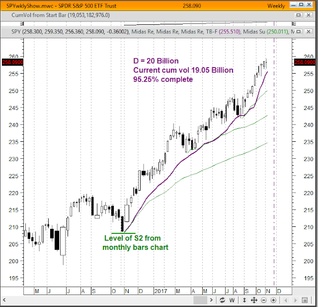
And now, for my final post of today, let's apply the same analysis to the S&P 500 as I did in my last few posts here.  Here's the weekly bars chart of SPY, the etf tracking the S&P 500...


Here I did the compromise fit of the TB-F to those two major pullbacks, which reveals that this accelerated up trend that began a year ago is 95% complete in terms of cumulative volume.  If average weekly trading volume continues as it has been for the last several weeks, this will get to 100% complete in about 2 or 3 weeks.  But, as I've said before, because of typical end of trend volatility, if a TB-F is at least 95% complete, the actual price up trend may already be done.  So, we can conclude that the S&P 500's up trend is either done now or will be in the next few weeks.

Small Caps Not Peaking Yet

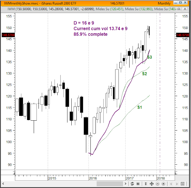
Let's apply the same kind of analysis to the small caps as I've done in my last few posts here.  Looking at the charts of IWM, the etf tracking the Russell 2000, I see different behaviors compared to the NASDAQ and the DOW.  The weekly bars chart of IWM doesn't show an accelerated up trend, but the monthly bars chart does, and here it is...


We see an accelerated up trend that started in early 2016.  I did the compromise fit of the TB-F curve at those two major pullbacks which shows that this up trend is about 86% complete in terms of cumulative volume.  If average monthly trading volume continues as it has been for the last several months, this trend will end in about four or five months.  My usual caveats apply.

NASDAQ's Uptrend Is Over

Let's look at the weekly bars chart of ONEQ, the etf that tracks the NASDAQ Composite Index.  What we find is behavior very similar to that of the Dow which I posted about earlier today. 


Just as with the DIA, this is an accelerated up trend that started a year ago and is 98% complete, essentially over.  This TB-F curve is fitted in a compromise at several pullbacks, so I feel good about it.  And just as with DIA, my usual caveats apply.

The Dow Re-visited

My October 18th post here analyzed DIA, the etf following the Dow Jones Industrial Average.  I fitted the TB-F to the April 21st price pullback.  That indicated that this uptrend was about 84% done w.r.t. cumulative volume, and if average weekly trading volume continues as it has been for the last several months, then we expect this uptrend to end in about two months from now.

Fitting a TB-F curve to a price trend is not always cut-and-dried.  Some up trends leave choices to the discretion of the user, and there are several rules of thumb for this.  One rule is to fit to the largest, most significant pullback, which is what I did in the Oct. 18th post.  However, as I look at this now, I'm having second thoughts about this choice.  There are two other rules, each of which is probably more significant than what I used.  The first of those two says to fit to the latest pullback, in this case Aug 25th.  And the second of these two says that when there are two or more pullbacks which all look significant, we should try to adjust the fitting parameter D so that we get a compromise fit, some pullbacks being above and others below the TB-F curve.  It is this latter rule I'm going to apply now.

Here is the DIA weekly bars chart with D adjusted so that we get a pretty good fit to all three of the pullbacks marked by the purple arrows.  For that, D has to be 825 million shares of cumulative volume...

We see that this works quite well, so I now feel this is the right way to do it for DIA.  

Since the current cum vol is 800.5 million shares, this means this uptrend is 97% complete, with the end most likely happening during this coming week.  This means that the Dow's uptrend that started about a year ago is essentially over now.  My usual caveat:  The end of a TB-F does not necessarily signal the beginning of a downtrend. What it does mean is that DIA's behavior from now on will be distinctly different from what it has been for the last 12 months.

In the upper pane of this chart I've included the so-called Money Flow Index (MFI), which is actually the volume weighted RSI oscillator.  As illustrated by the red trend lines, we see that since early August the MFI has been in a strong bearish divergence from the price.  This implies that the internals of the DIA's up trend have significantly weakened, consistent with the TB-F having ended. 


Thursday, October 19, 2017

Google At or Near Its End

Now let's look at the last of the FANG stocks, Google (Alphabet, ticker GOOGL).  I found that the quarterly bars chart and the monthly bars chart each sports a well fit TopFinder that is at or near its end.  Here's the quarterly bars chart...

This strongly accelerated up trend started in early 2011 and is currently about 98% complete.  Due to typical end of trend volatility, we consider anything greater than 95% to be essentially complete.  So, on this timeframe, this up trend has ended.

Now here's the monthly bars chart...
In this chart, there's some question as to which pullback(s) to fit the TopFinder to.  In my experience, fitting to the latest pullback works best.  Doing that here also captures an earlier pullback.  These fitting points are indicated by the small arrows.  So, I think this is a good fit.  

This TopFinder is almost 95% done, and we consider anything above 95% to be essentially done.  At the current rate of monthly trading volume it would take 3 or 4 more months to get to exactly 100%.  

So, my conclusion for Google is that its long term up trend is either done now or will end sometime between now and 3 or 4 months from now, assuming average monthly trading volume stays as it has been for the last several months.

------------------------

This ends my review of the FANG stocks and the Dow.  If we can generalize from these five to the whole market, the current long term market up trend will end sometime within the next 3 to 4 months, sooner if trading volume significantly increases.


Wednesday, October 18, 2017

Facebook - A Few More Months to Go

Resuming now our review of the FANG stocks, here's Facebook (FB).  I see that there are two different timeframe charts of FB which show TopFinders that are late in their lives, the monthly bars chart and the weekly bars chart.  Here's the long term monthly bars chart...

This accelerated uptrend started in mid 2013, having spawned a four-fold hierarchy of S curves (green), so it's late in its life.   

A TopFinder (TB-F) fits nicely to both the Aug. 2015 and the Dec. 2016 pullbacks, giving us confidence in its validity.  The fitting parameter D is at 41.8 billion shares of cumulative volume, and as of this writing the cum vol is 39.65 billion, so this trend is about 95% complete.  The dashed vertical line sits at the 41.8 billion share position, where we expect the trend will end.  If average monthly trading volume continues as it has for the last half year or so, then it will take 6 or 7 months to get to the end.  

Now, let's look at the weekly bars chart.  We see that since the end of 2016, price seems to be rising at a significantly greater rate than it was prior to that.  So, let's look at the weekly bars chart covering the past year...

Here we see price rising far above the lowest S curve (green), so this is a highly accelerated trend, now spawning a three-fold hierarchy of S curves.  To fit the TB-F to this trend requires D to be 5.6 billion shares of cum vol.  As of this writing, the cum vol is 4.11 billion shares, so this trend is about 73% done, projected to end at the dashed vertical line.  If we assume that average weekly trading volume continues at the rate it's been for the last half year or so, then it will take 4 or 5 months for this to end.  And of course, if trading volume increases it will end sooner, or later if trading slackens. 

So, we have the long term TB-F saying we've got 6 or 7 months to go and the intermediate term one saying 4 or 5 months.  Is this a problematic discrepancy?  Not really.  I've noticed that once a TB-F gets over 95% done, price action tends to become messy, and the end often comes somewhere between 95% and 105%.  At this point, we're getting a more accurate reading from the weekly bars TB-F.  And also, these time estimates vary with the average rate of trading volume.  We'll just have to keep watching these charts as these trends progress to their ends.

The Dow - A Few More Months to Run

Before finishing my review of the FANG stocks, let's look at the Dow Jones Industrial Average since the financial press is hyperventilating at every new high the Dow reaches, with lots of hand wringing as to when it's going to end.  Midas Analysis should give us insight as to how far along the Dow is in this strong up market.

Let's apply our analysis to DIA, the etf following the Dow.  Checking out charts of several timeframes, I see that the weekly bars chart of DIA here shows a well developed accelerated uptrend in progress...

 The uptrend started a year ago and has spawned a four-fold hierarchy of Midas support curves, S1 thru S4.  The price trend is riding far above S1, so this is an accelerated uptrend.  Four is the most common number of support curves in an accelerated uptrend before it ends, sometimes three or five, so this trend is well along in its life.   

Fitting the TopFinder (TB-F) to this trend at the April '17 pullback needs D to be 900 million shares of cumulative volume since its start.  As of this writing, the cum vol is 753 million, so this trend is about 84% complete in terms of cum vol.  The horizontal axis is linear in cum vol, not time, which allows me to position that dashed vertical line at the 900 million shares position, which is where we expect the trend will end.  We don't know when it will end or at what price, but we will see that it has ended once we get there.  If you assume that average weekly trading volume will continue as it has for the last several months, then the end of the trend will come in about three months.  If trading volume increases significantly, the end will arrive sooner; conversely if trading slows down, the end will come later.  

Saturday, October 14, 2017

Netflix - A Few More Months to Run

Two months ago I started a review of the four FANG stocks (see my Aug. 9 post here) since they have been the leaders of this huge bull market we're in.  I'm looking at each one, on several timeframes, to see if Midas analysis can tell us how close each is to the end of its uptrend.  The Aug. 9 post showed that AMZN's uptrend, on the very long term timeframe of a quarterly bars chart, has ended.  Now, let's look at Netflix (NFLX).

Both the monthly bars and the weekly bars charts of NFLX show that it has been in a highly accelerated uptrend since July of 2016.  Here's the weekly bars chart...


 A TopFinder, TB-F, fits nicely to this trend using the fitting parameter D =  3 billion shares of cumulative volume.  To date, the cum vol from the beginning of this trend is 2.407 billion shares, so this trend is 80.2 % complete in terms of cum vol.  

Remember, this is a candlevolume display chart, so the horizontal axis is linear in cum vol, not time.  This allows me to position that dashed vertical line at the horizontal location which is 3 billion shares of cum vol since the trend's start.  This is the location where we expect the trend will end.  

In MetaStock, the charting program I'm using here, in candlevolume display it makes invalid assumptions on how to label the dates on the horizontal axis that are in the future, so you should ignore them.  

This chart does not give a prediction of when this trend will end, rather, it identifies what the cum vol will be when it ends.  In other words, we'll know when we get there.  IF, and this is a very big if, the average weekly trading volume stays the same as it has been for the last half year or so, then we could identify a date in the future when cum vol will get to 3 billion.  Just put a ruler on the chart, measure the distance from the latest price bar to the dashed vertical line, then measure that same distance back in time and you'll end up at about mid June of this year.  So, IF average trading volume remains as it has been this year, then we can expect this trend to end in about four months.  If trading volume increases significantly going forward, this trend will end sooner; and conversely if trading volume slows, this trend will take longer to end.  

A TopFinder also fits nicely to the monthly bars chart (not shown here) and leads to the same conclusions as on this weekly bars chart.


Sunday, October 1, 2017

NASDAQ Showing Distribution

Using my Modified Volume-Price Trend (MVPT) indicator, I'm seeing distribution in the exchange traded funds that follow the NASDAQ Composite, ONEQ, and the NASDAQ 100, QQQ. 

The MVPT is a refinement of the Volume Price Trend (VPT) indicator, which in turn is a refinement of Granville's On-Balance Volume (OBV) indicator.  Both refinements reduce the noise and volatility of the OBV and keep the indicator close to the price trace in times of "normal" trading while allowing the indicator to diverge from price during phases of accumulation or distribution.  See my article, "Modified Price-Volume Trend Indicator" in the April 2010 issue of Stocks & Commodities magazine [Technical Analysis of Stocks & Commodities, vol. 28 no. 5, p22]. 

Here's the daily bars chart of ONEQ for the last 12 months, price in black candles and the MVPT in purple...

You can see that MVPT is in a dramatic downward divergence from price starting in May of this year.  
Similarly, here's the chart of QQQ...


Here the divergence is even more dramatic.  

What does this mean?  The usual interpretation is that the "smart" money is getting out of the stock even while the price continues to rise.  Usually this foretells a coming drop in the price, but without knowing when that will happen.  See my article for a full discussion of these behaviors.

I've looked at the ETFs following other market indexes.  Some, such as the SPY, show modest distribution, but none as dramatic as these two. 


Wednesday, August 9, 2017

Hockey Stick Amazon - All Done

As this bull market powers on, I'm examining the question, "Are the FANG stocks peaking?"  I'm looking at each of these four on several time frames to see if a TopFinder can be fit to the chart, giving us an indication of whether it's near the end of this up move.  When I looked at Amazon (AMZN) on the very long term time frame - quarterly bars chart - from its IPO in 1997, I saw this most amazing chart...

  This is a hockey stick chart!  It goes from the 2008 low of 34.68 up to this quarter's high (so far) of 1083.31, a 3,124 % increase, a compound growth rate of 26% per year.  When you switch this chart to a semilog display, it shows that a straight line fits the move very well, i.e., this truly has been an exponential move.

What's most interesting to me is that the TopFinder fits perfectly to this move (purple curve) and the algorithm says that the move is done (Who's going to quibble over 0.2%?).  This means that the hockey stick up move is now over.  

The usual caveat...

•  The TopFinder is a concurrent indicator, not a predictive one.  It tells you what is happening now.  It's telling us that this hockey stick move has ended, but it does NOT tell us what comes next - only that it will be different.  So, it's telling you that now is a good time to close out your long position, but it's not necessarily the right place to go short.

Monday, July 3, 2017

The Intermediate Term Market

This is the third blog post on the current status of the market, here the intermediate term timeframe, as shown on this weekly bars chart...


An uptrend (not accelerated) started in early February 2016.  Its first pullback supported at the first Midas support curve, but the second pullback strongly broke down through the second Midas support curve.  This means that uptrend ended.  But quite dramatically, last October, the strong down week that ended that trend came to a screeching halt right at the level of the S2 support curve on the monthly bars chart.  From there, price bounced up sharply into a new accelerated uptrend to which that TopFincder is fitted.  It's about 74% complete now, projected to end at the dashed purple vertical line.  
 
It's interesting to compare this chart with the long term monthly bars one that I just posted.  On the long term chart we see a pullback last fall from which S3 is launched.  That pullback corresponds with the location of the start of the TopFomder on this weekly bars chart.  It appears that the long term and the intermediate term TopFinders will end at about the same point.

The Long Term Market

This is the second of three blog posts on the current status of the market.  Here is the monthly bars chart of SPY...


On this time frame, we see an accelerated uptrend that started mid-2011, with its fitted TopFinder TF1 which ended in mid-2014.  This was followed by a two year long trading range, bracketed by the blue lines.  Late in that trading range, a new accelerated uptrend started in late 2015, spawning a three-fold hierarchy of Midas support curves (S1, S2 and S3), along with a fitted TopFinder which is currently about 78% through its duration of 46 billion shares of cumulative volume.  The purple vertical line marks the projected end of this accelerated uptrend.  And as I said in the last post, ignore the dates that the plotting program has placed on the horizontal axis going into the future.  We will know when the trend ends when we get there, but not before.

Semiannual, Quarter, Month and Week-end Reviews

At the end of last week, we are at the end of the week, the month, the quarter and the half year.  It's time to review what the market, as exemplified by SPY, is doing on all four of these time frames:
•  Very Long Term - Quarterly bars chart
•  Long Term - Monthly bars chart
•  Intermediate Term - Weekly bars chart
•  Short Term - Daily bars chart.

I'll do this in three blog posts here, starting with this one, Very Long Term.

But first, let me reiterate my general understanding:  One cannot predict the market.  Technical analysis, including my Midas tools, does not and cannot predict what prices will do in the future.  Rather, it shows what the market is doing in the present, and it is exquisitely good at detecting and signaling when the market's behavior has changed so that you may keep your trading in line with the market.  And that's how to make money in the market, not by following a prediction, but rather by carefully staying in sync with the market.  So, nowhere in my posts here am I making any prediction of the future movement of the market.


The Very Long Term, the quarterly bars chart

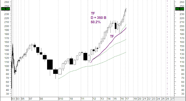
Here is the quarterly bars chart of SPY from its 1993 inception, plotted in candle volume display...


The market has been in an uptrend since that historic bottom in early 2009.  There was a modest pullback in 2011, but from there it launched into an accelerated uptrend.  The definition of accelerated is that the first pullback (here in 2015) occurs far above the Midas support curve launched from the beginning of the accelerated trend - the middle green curve here.  When this happens, we may fit a TopFinder curve (TF) to the trend, the purple curve here.  The value of the free variable, the fitting parameter D, needed to fit the curve to the pullback is the projected total cumulative volume that the trend will have consumed when it ends.  Here, D is 350 billion shares.  Right now, the accelerated trend's cumulative volume is 50.2% of D, so at present we are half way through the duration of this accelerated trend as measured by cumulative volume.  Since the chart's horizontal axis is linear in cumulative volume, not time, I can and have placed that dashed purple vertical line at the horizontal location corresponding to 350 billion shares of cum vol, which is the projected horizontal location of the end of this trend. 

Notice that this is not a prediction of when and at what price the trend will end; we don't know when and at what price, but we will know when we get there because D will have been fully consumed.  The date we get there depends entirely on what the trading volume per quarter will be going forward, which we don't know.  This chart is produced by MetaStock, and that program makes some very dubious assumptions about what the future trading volume per quarter will be and places dates in the future accordingly.  Those date should be completely ignored.

Conclusion:  On this time frame the market is half way in cum vol through an accelerated uptrend that began in mid 2011. 

Saturday, March 11, 2017

The End of the Trump Rally

A number of analysts, citing various combinations of indicators, are saying that the so called Trump Rally that started after the election has ended.  Here I'll show that all one needs is the Midas TopFinder algorithm to know that that rally has just now ended.

Look at my Jan. 1, 2017 post here called The Intermediate Term Market, an analysis of the weekly bars chart of SPY.  It shows the beginning of the rally in early November.  I said, "...price bounced up sharply into a new uptrend.  The most recent few weeks have shown some weakness, but we're still far above the support curve for this trend, so we're still in an uptrend on this timeframe."

After Jan. 1, that brief weakness reversed and the market resumed the strong uptrend.  The Jan. weakness was the first pullback within that strong uptrend.  Since that pullback was far above the Midas S curve launched from the beginning of the trend, that meets the definition of an accelerated uptrend, so one may fit a Midas TopFinder curve to that pullback which I have done in this new chart updated to yesterday.


The value of the fitting parameter D that is necessary to make the curve fit the Jan. pullback is 7.6 billion shares of cumulative volume.  In the upper pane we see that the actual cumulative volume since the election is 7.477 billion shares, which is 98% of D.  That's close enough to declare that the TopFincer curve has ended, and thus the Trump Rally is over.

Now, as I've emphasized in these blog posts many times, the TopFinder is a concurrent indicator, not a predictive one.  It has identified that now is the end of that rally, but it does not predict what comes next.  Typically, after such an end, we get some kind of a consolidation, after which the market does something new, which could be either a down move or an up move.  All we can be fairly certain of is that the accelerated uptrend that has come to be known as the Trump Rally has ended.

Sunday, January 1, 2017

Short Term Timeframe

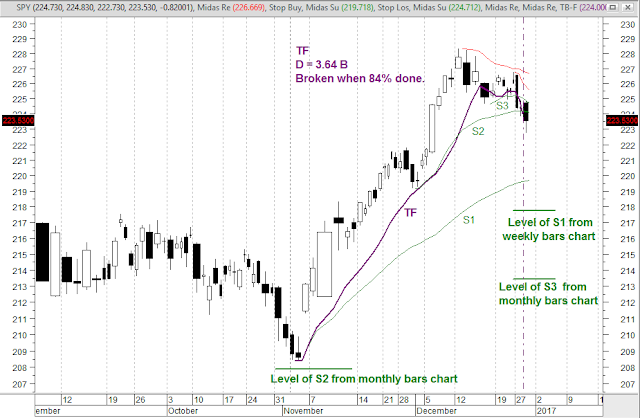
This is the fourth and last blog post in this series, here showing the short term status of the market as displayed on the daily bars chart...


Here an accelerated uptrend started in early November last year, with the TopFinder TF fitted to it, and spawning a three-fold hierarchy of Midas support curves - S1, S2 and S3.  The TF ended last Thursday, but about two weeks earlier, price definitively broke and closed below TF.  So, the TopFinder came to a premature end.  Is this a failure of the methodology?  No, it means some exogenous unexpected event abruptly changed the behavior of the market, breaking the TopFinder.  Sometimes, this can and does happen.  Up until that break, the TF was correctly telling us that the market was in an accelerated uptrend.  And at that break, the TF gave us a prescient early notice that the uptrend has ended.  Since then, price has broken down through S3 and S2.

We now see that we are in a new downtrend that started at the mid October peak, spawning a hierarchy of Midas resistance curves (red).  We don't know, and cannot predict, how low this downtrend will go, but we have identified a ladder of support levels under the current price - the S1 of this chart, the level of the S1 from the weekly bars chart, and the level of S3 from the monthly bars chart.  Going forward, if we see price turning up at one of these levels, that could well be the end of this downtrend. 

This ends my four blog post review of the market.  HAPPY NEW YEAR EVERYONE!

The Intermediate Term Market

This is the third of four blog posts on the current status of the market, here the intermediate term timeframe, as shown on this weekly bars chart...


An uptrend (not accelerated) started in early February 2016.  Its first pullback supported at the first Midas support curve, but the second pullback strongly broke down through the second Midas support curve.  This means that uptrend ended.  But quite dramatically, the strong down week that ended that trend came to a screeching halt right at the level of the S2 support curve on the monthly bars chart.  From there, price bounced up sharply into a new uptrend.  The most recent few weeks have shown some weakness, but we're still far above the support curve for this trend, so we're still in an uptrend on this timeframe.

The Long Term Market

This is the second of four blog posts on the current status of the market.  Here is the monthly bars chart of SPY...


On this timeframe, we see an accelerated uptrend that started mid-2011, with its fitted TopFinder TF1 which ended in mid-2014.  This was followed by a two year long trading range, bracketed by the blue lines.  While still in that trading range, a new accelerated uptrend started in late 2015, spawning a three-fold hierarchy of Midas support curves (S1, S2 and S3), along with the fitted TopFinder TF2 which is currently about 57% through its duration of 46 billion shares of cumulative volume.  The purple vertical line marks the projected end of this accelerated uptrend.  And as I said in the last post, ignore the dates that the plotting program has placed on the horizontal axis going into the future.  We will know when the trend ends when we get there, but not before.

Year-, Quarter-, Month- and Week-end Reviews

[Corrected]

We are now (Jan. 1) at the end of the week, the month, the quarter and the year.  It's time to review what the market, as exemplified by SPY, is doing on all four of these timeframes:

•  Very Long Term - Quarterly bars chart
•  Long Term - Monthly bars chart
•  Intermediate Term - Weekly bars chart
•  Short Term - Daily bars chart.

I'll do this in four blog posts here, starting with this one, Very Long Term.

But first, let me reiterate my general understanding:  One cannot predict the market.  Technical analysis, including my Midas methodologies, does not and cannot predict what prices will do in the future.  Rather, it shows what the market is doing in the present, and it is exquisitely good at detecting and signaling when the market's behavior has changed so that you may keep your trading in line with the market.  And that's how to make money in the market, not by following a prediction, but rather by carefully staying in sync with the market.  So, nowhere in my posts here am I making any prediction of the future movement of the market.


The Very Long Term, the quarterly bars chart

Here is the quarterly bars chart of SPY from its 1993 inception, plotted in candle volume display...


The market has been in an uptrend since that historic bottom in early 2009.  There was a modest pullback in 2011, but from there it launched into an accelerated uptrend.  The definition of accelerated is that the first pullback (here in 2015) occurs far above the Midas support curve launched from the beginning of the accelerated trend - the middle green curve here.  When this happens, we may fit a TopFinder curve (TF) to the trend, the purple curve here.  The value of the free variable, the fitting parameter D, needed to fit the curve to the pullback is the projected total cumulative volume that the trend will have consumed when it ends.  Here, D is 350 billion shares.  Right now, the accelerated trend's cumulative volume is 47.5% of D, so at present we are a little less than half way through the duration of this accelerated trend as measured by cumulative volume.  Since the chart's horizontal axis is linear in cumulative volume, not time, I can and have placed that dashed purple vertical line at the horizontal location corresponding to 350 billion shares of cum vol, which is the projected horizontal location of the end of this trend. 

Notice that this is not a prediction of when and at what price the trend will end; we don't know when and at what price, but we will know when we get there because D will have been fully consumed.  The date we get there depends entirely on what the trading volume per quarter will be going forward, which we don't know.  This chart is produced by MetaStock, and that program makes some very dubious assumptions about what the future trading volume per quarter will be and places dates in the future accordingly.  Those date should be completely ignored.

Conclusion:  On this timeframe the market is nearly half way in cum vol through an accelerated uptrend that began in mid 2011.