Sunday, January 1, 2017

Short Term Timeframe

This is the fourth and last blog post in this series, here showing the short term status of the market as displayed on the daily bars chart...


Here an accelerated uptrend started in early November last year, with the TopFinder TF fitted to it, and spawning a three-fold hierarchy of Midas support curves - S1, S2 and S3.  The TF ended last Thursday, but about two weeks earlier, price definitively broke and closed below TF.  So, the TopFinder came to a premature end.  Is this a failure of the methodology?  No, it means some exogenous unexpected event abruptly changed the behavior of the market, breaking the TopFinder.  Sometimes, this can and does happen.  Up until that break, the TF was correctly telling us that the market was in an accelerated uptrend.  And at that break, the TF gave us a prescient early notice that the uptrend has ended.  Since then, price has broken down through S3 and S2.

We now see that we are in a new downtrend that started at the mid October peak, spawning a hierarchy of Midas resistance curves (red).  We don't know, and cannot predict, how low this downtrend will go, but we have identified a ladder of support levels under the current price - the S1 of this chart, the level of the S1 from the weekly bars chart, and the level of S3 from the monthly bars chart.  Going forward, if we see price turning up at one of these levels, that could well be the end of this downtrend. 

This ends my four blog post review of the market.  HAPPY NEW YEAR EVERYONE!

The Intermediate Term Market

This is the third of four blog posts on the current status of the market, here the intermediate term timeframe, as shown on this weekly bars chart...


An uptrend (not accelerated) started in early February 2016.  Its first pullback supported at the first Midas support curve, but the second pullback strongly broke down through the second Midas support curve.  This means that uptrend ended.  But quite dramatically, the strong down week that ended that trend came to a screeching halt right at the level of the S2 support curve on the monthly bars chart.  From there, price bounced up sharply into a new uptrend.  The most recent few weeks have shown some weakness, but we're still far above the support curve for this trend, so we're still in an uptrend on this timeframe.

The Long Term Market

This is the second of four blog posts on the current status of the market.  Here is the monthly bars chart of SPY...


On this timeframe, we see an accelerated uptrend that started mid-2011, with its fitted TopFinder TF1 which ended in mid-2014.  This was followed by a two year long trading range, bracketed by the blue lines.  While still in that trading range, a new accelerated uptrend started in late 2015, spawning a three-fold hierarchy of Midas support curves (S1, S2 and S3), along with the fitted TopFinder TF2 which is currently about 57% through its duration of 46 billion shares of cumulative volume.  The purple vertical line marks the projected end of this accelerated uptrend.  And as I said in the last post, ignore the dates that the plotting program has placed on the horizontal axis going into the future.  We will know when the trend ends when we get there, but not before.

Year-, Quarter-, Month- and Week-end Reviews

[Corrected]

We are now (Jan. 1) at the end of the week, the month, the quarter and the year.  It's time to review what the market, as exemplified by SPY, is doing on all four of these timeframes:

•  Very Long Term - Quarterly bars chart
•  Long Term - Monthly bars chart
•  Intermediate Term - Weekly bars chart
•  Short Term - Daily bars chart.

I'll do this in four blog posts here, starting with this one, Very Long Term.

But first, let me reiterate my general understanding:  One cannot predict the market.  Technical analysis, including my Midas methodologies, does not and cannot predict what prices will do in the future.  Rather, it shows what the market is doing in the present, and it is exquisitely good at detecting and signaling when the market's behavior has changed so that you may keep your trading in line with the market.  And that's how to make money in the market, not by following a prediction, but rather by carefully staying in sync with the market.  So, nowhere in my posts here am I making any prediction of the future movement of the market.


The Very Long Term, the quarterly bars chart

Here is the quarterly bars chart of SPY from its 1993 inception, plotted in candle volume display...


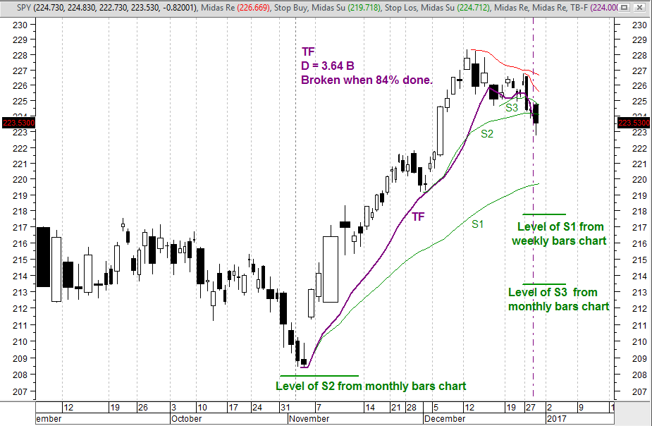
The market has been in an uptrend since that historic bottom in early 2009.  There was a modest pullback in 2011, but from there it launched into an accelerated uptrend.  The definition of accelerated is that the first pullback (here in 2015) occurs far above the Midas support curve launched from the beginning of the accelerated trend - the middle green curve here.  When this happens, we may fit a TopFinder curve (TF) to the trend, the purple curve here.  The value of the free variable, the fitting parameter D, needed to fit the curve to the pullback is the projected total cumulative volume that the trend will have consumed when it ends.  Here, D is 350 billion shares.  Right now, the accelerated trend's cumulative volume is 47.5% of D, so at present we are a little less than half way through the duration of this accelerated trend as measured by cumulative volume.  Since the chart's horizontal axis is linear in cumulative volume, not time, I can and have placed that dashed purple vertical line at the horizontal location corresponding to 350 billion shares of cum vol, which is the projected horizontal location of the end of this trend. 

Notice that this is not a prediction of when and at what price the trend will end; we don't know when and at what price, but we will know when we get there because D will have been fully consumed.  The date we get there depends entirely on what the trading volume per quarter will be going forward, which we don't know.  This chart is produced by MetaStock, and that program makes some very dubious assumptions about what the future trading volume per quarter will be and places dates in the future accordingly.  Those date should be completely ignored.

Conclusion:  On this timeframe the market is nearly half way in cum vol through an accelerated uptrend that began in mid 2011.